There have been pollution monitoring sensors and stations for a while now, which measure particulate matter, ozone, NO2, carbon monoxide, and a few other hazardous emissions. You can view global pollution data readings in real time, and that is great news if you are sensitive to toxic air. However, there is a very big drawback to the ways these numbers are collected. Geography, wind, buildings, proximity to traffic all add a lot of variability to readings. The air at the top of a US embassy building might be fair, but the air at the intersection down the street among the buses, diesel delivery trucks, and street vendor stoves can be absolutely noxious. Height of the sensors is extremely important, especially when gases tend to settle low in avenues and streets, among the bikers, commuters, and baby strollers. Air quality sensors have been a topic of debate in Delhi, India, as the uniform height mandates caused the true level of pollution in the city to be underrepresented and misunderstood.

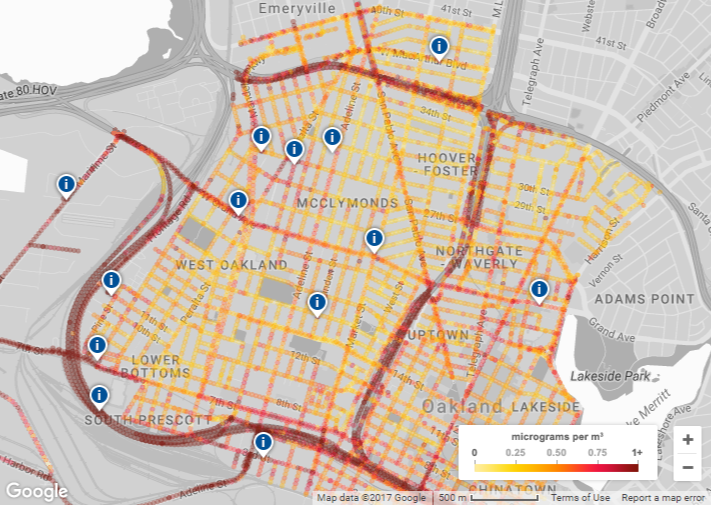
The map shown above is part of Google’s recent project to show the air quality right down to the block you are standing on in Oakland, California. The project is in partnership with the Environmental Defense Fund (EDF) and Aclima, a pollution sensor startup it has been working with to map environmental changes in the Bay Area, Central Valley and Los Angeles since 2015.
Google strapped Aclima sensors to its StreetView cars shortly after it began working with the company and its maps can now give you street-level data in areas with higher amounts of nitric oxide (NO), nitrogen dioxide (NO2) and black carbon particulates — all pollutants coming from car exhaust, all very hazardous to lung tissue and carcinogenic.
The project was able to identify local hot spots of pollution, which was critical to modelling what how intersections, congestion patterns, and street setups affect the air that we actually breathe every day. They also plan to correlate the data to medical histories of asthma attacks to better understand how pollution afflicts sensitive lungs.
One good example of how the map can help environmental scientists in the Bay Area is the ability to track higher pollution due to cars speeding up near the Bay Bridge to cross under or merge onto I-80, which is a freeway with frequent traffic congestion that goes beyond just rush hour and can sometimes even be affected on the weekends.
In a Google blog post, out today, Google claimed its pollution data set to be the largest ever published, “With nearly 3 million measurements and 14,000 miles captured in the course of a year,” and said it could apply the data to other cities in the future.
Hopefully, this data will provide even more incentive to invest in clean transportation solutions. Whatever your feelings on climate change, protecting the air that we actually breathe in our city streets, stores, and homes should be a national and global undertaking. It’s nice to see Google assuming a leadership role.